03. Would buying a sharp crypto dip work?
How a simple EMA dip rule changed, and why its backtest was not a live track record.
Investing on my own · Part 3/22 · Evidence through 2026-09-22. Historical research is distinct from DRY and live execution.
One of the ideas that stayed with the project longest was a fairly simple one: buy a coin after a large decline relative to its recent average, then sell roughly a day later.
In June 2026, I asked to test it across the available exchanges and assets. I used an exponential moving average, or EMA, which gives more weight to recent prices. The idea came from my earlier experiments with mean reversion rather than from a complicated new model.
📉 How large a decline?
Imagine a coin whose recent average price is 100 suddenly trading at 80. Perhaps there is bad news. Perhaps the exchange has a problem. Perhaps selling has overwhelmed a thin order book. The initial research question was whether rebounds after such declines occurred often enough to trade.
I compared several thresholds, including declines of 20%, 25%, 30%, 35%, and 40%. I also examined hourly and five-minute bars. I wanted to understand how sensitive the result was to these choices.
Buying at the same closing price that generated the signal would be generous: I only know the completed bar after it ends. The research therefore used the next bar’s open as an execution proxy. That does not establish an available quote for my intended size, but it keeps the simulated trade after the signal.
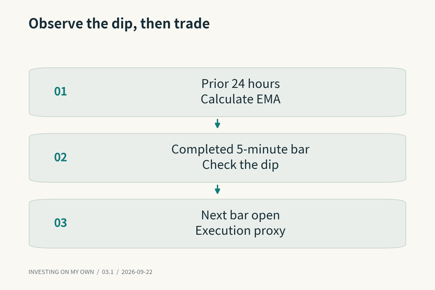
A later representative configuration looked for a five-minute close at least 20% below the prior 24-hour EMA. It applied listing-age and liquidity filters, checked distinct execution venues, and included a cooldown to prevent repeatedly buying the same asset.
📊 The results depended on the experiment
An early hourly candidate used a 40% decline and approximately one day of holding. Its report showed a CAGR of about 8.97% and a maximum drawdown of about 9.33%. Its headline Sharpe was around 3.33, while the daily-return version was approximately 1.02.
That difference deserved attention. The same collection of trades can look quite different depending on how returns are sampled and annualized. I began checking the measurement interval alongside the number.
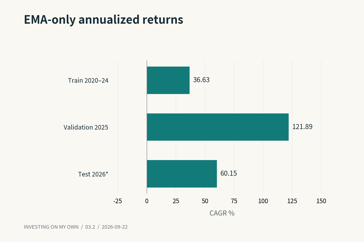
A separate late-August experiment reported EMA-only CAGRs of 36.63% for training, 121.89% for validation, and 60.15% for the test period. Training covered 2020–2024, validation covered 2025, and the test ended on August 22, 2026. The last figure annualizes less than a full year.
This was not simply the original hourly strategy improving. Thresholds, venue checks, liquidity rules, and sizing differed. Two reports can both say “EMA” while describing quite different sets of trades.
Position size also required care. Large declines often happen together. Treating every falling coin as an independent opportunity can create much more common exposure than the individual trade rules suggest. I needed account-level constraints and limits on repeated exposure to the same asset.
🔎 Comparing a backtest with a running system
When a dry run lost money, I asked why it differed from the historical result. I wanted the actual configuration and trade records compared, rather than an explanation based only on a changing market regime.
The comparison found meaningful differences. The stronger historical artifact required confirmation from two execution venues and a complete exit window. The inspected runtime allowed a single confirmation and handled the end of the holding window differently.
The definition of a confirming venue mattered as well. An exchange used as a reference price source is not automatically an exchange on which the strategy can trade. Seeing several prices and satisfying the execution conditions on two venues are different checks.
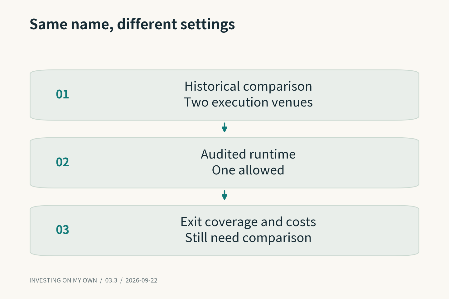
Those discrepancies were plausible contributors, not a complete explanation of every loss. Fees, entry timing, unrealized positions, and forced exits still had to be examined. The useful comparison was between exact rules and exact records.
Execution work continued into September, so the August dry-run snapshot no longer describes the entire project. The charts here nevertheless remain historical research results. They are not charts of realized live returns.
The unresolved question that interests me most is the cause of a crash. Temporary selling pressure, a trading suspension, and the failure of an asset can initially look similar on a price chart. A return toward the old average is much less plausible in some of those cases.
I continue to study the rule because a simple idea produced relatively strong results across the tested periods. The next useful evidence is whether it survives actual prices and available size when the market is falling sharply.
That is a more demanding question than whether another historical curve can look attractive. It also seems closer to the reason I started the experiment in the first place.
Previous · Series index · Next